


When it comes to understanding the stock market, numbers alone can feel overwhelming. But what if you could turn those numbers into clear, visual stories? That’s exactly what stock charting tools like Matplotlib and Plotly help you do.
Whether you’re a curious beginner exploring your financial journey or a company employee diving into market data, this guide will show you how to visualize stock trends, spot patterns, and gain real-world insights—all by using Python’s most powerful charting libraries.
Let’s demystify the world of stock charts and make your first step toward financial literacy and long-term success easier and exciting.
📈 Why Visualize Stock Data?
Before diving into code, let’s understand why plotting stock charts matters:
- Understand Market Trends: Charts reveal bullish or bearish patterns over time.
- Make Informed Decisions: Investors and analysts rely on visual cues to make buying or selling decisions.
- Communicate Insights Clearly: A well-designed chart can explain complex financial data better than a spreadsheet.
Whether you’re analyzing tech stocks for work or tracking personal investments, visualization is your financial flashlight.
🔧 Tools of the Trade: Matplotlib vs. Plotly
Python’s ecosystem gives you several powerful tools, but two stand out when it comes to stock charting:
Matplotlib
- Traditional, static plots
- Ideal for quick, simple line graphs
- Great for basic time series analysis
Plotly
- Interactive charts (zoom, hover, pan)
- Web-ready visuals for dashboards or presentations
- Perfect for storytelling with data
Both have their strengths. Use Matplotlib when you need simplicity. Choose Plotly when interactivity matters.
👨💻 Getting Started: Plotting Your First Stock Chart
Let’s walk through a simple example using real stock data from Yahoo Finance. For this, we’ll use the yfinance library to fetch data, and Matplotlib/Plotly to plot it.
🔹 Step 1: Install Required Libraries
bash
CopyEdit
pip install yfinance matplotlib plotly
🔹 Step 2: Fetch Stock Data
python
CopyEdit
import yfinance as yf
stock = yf.download(‘AAPL’, start=’2023-01-01′, end=’2023-12-31′)
print(stock.head())
🔹 Step 3: Plot Using Matplotlib
python
CopyEdit
import matplotlib.pyplot as plt
plt.figure(figsize=(10, 5))
plt.plot(stock[‘Close’], label=’AAPL Closing Price’)
plt.title(‘Apple Stock Price in 2023’)
plt.xlabel(‘Date’)
plt.ylabel(‘Price ($)’)
plt.legend()
plt.grid(True)
plt.show()
🔹 Step 4: Plot Using Plotly
python
CopyEdit
import plotly.graph_objs as go
fig = go.Figure()
fig.add_trace(go.Scatter(x=stock.index, y=stock[‘Close’], mode=’lines’, name=’AAPL’))
fig.update_layout(title=’Apple Stock Price (Interactive)’, xaxis_title=’Date’, yaxis_title=’Price ($)’)
fig.show()
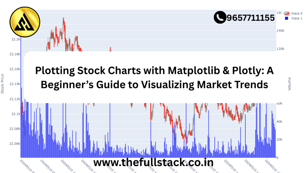
These charts give you immediate insights into how the stock performed—price dips, rallies, and trends over the year.
💡 Practical Tips for Beginners
- Start Small: Pick 1–2 companies you know. Apple, Tesla, or even local banks.
- Use Daily or Weekly Timeframes: Daily charts are great for beginners. Weekly charts show long-term trends.
- Combine with Indicators: Once you’re confident, explore moving averages, RSI, and volume overlays.
- Learn from Mistakes: Misreading a chart isn’t a failure—it’s a step forward in learning how markets behave.
🏢 Real-World Applications for Employees
If you’re working in finance, sales, marketing, or data analytics, stock charting can:
- Inform competitor research
- Strengthen presentations with visual financial data
- Improve decision-making based on market movements
- Empower internal financial literacy initiatives
Imagine giving your next presentation with a Plotly dashboard showing live competitor stock movements. That’s not just data—that’s insight.
🚀 From Learning to Earning: Take the Next Step
Plotting stock charts isn’t just a technical skill—it’s a bridge to understanding the economy, your industry, and your personal investments.
Ready to go deeper?
👉 Explore our beginner to advanced courses on financial data visualization, available here
👉 Join our free financial literacy bootcamp and get hands-on with real-world data
🔚 Final Thoughts
Financial literacy is no longer optional—it’s essential. Whether you’re a student, a professional, or someone just curious about the markets, learning to visualize stock data with Matplotlib and Plotly puts powerful tools at your fingertips.
So, plot that first chart. See the trend. Ask questions. Make smarter decisions. The journey to mastering market insights starts today.
You might be like this:-
What is AWS Lambda?A Beginner’s Guide to Serverless Computing in 2025
Java vs. Kotlin: Which One Should You Learn for Backend Development?
Where to Find Your Salesforce Organization ID
How Salesforce Stands Out from Other CRMs
Frequently Asked Questions
What are the benefits of using Matplotlib and Plotly for plotting stock charts?
Matplotlib and Plotly are popular data visualization libraries that offer a range of benefits, including ease of use, customization options, and the ability to create interactive and dynamic visualizations. They allow users to quickly and easily create a variety of stock charts, from simple line charts to complex technical indicators. This enables users to gain insights into market trends and make more informed investment decisions.
Do I need to have prior experience with Python to use Matplotlib and Plotly for stock chart plotting?
While prior experience with Python can be helpful, it is not necessary to use Matplotlib and Plotly for stock chart plotting. These libraries are designed to be user-friendly and offer a range of tutorials and resources for beginners. With some basic knowledge of Python and a willingness to learn, anyone can start using Matplotlib and Plotly to create high-quality stock charts.
How do I choose between Matplotlib and Plotly for my stock chart plotting needs?
The choice between Matplotlib and Plotly depends on your specific needs and goals. Matplotlib is ideal for creating static, 2D charts, while Plotly is better suited for creating interactive, web-based visualizations. Consider the type of chart you want to create, the level of interactivity you need, and the platform on which you plan to display your charts when deciding between these two libraries.
Can I use Matplotlib and Plotly to create real-time stock charts?
Yes, both Matplotlib and Plotly can be used to create real-time stock charts, but this requires additional setup and configuration. You will need to connect to a data feed, such as a stock market API, and use a scheduling tool to update your charts at regular intervals. With the right tools and techniques, you can create dynamic, real-time stock charts that reflect current market conditions.
Are there any resources available to help me learn more about using Matplotlib and Plotly for stock chart plotting?
Yes, there are many resources available to help you learn more about using Matplotlib and Plotly for stock chart plotting, including tutorials, documentation, and online courses. The official Matplotlib and Plotly websites offer a range of tutorials and examples, and there are many online communities and forums dedicated to data visualization and stock market analysis. With these resources, you can quickly get started with creating high-quality stock charts and continue to learn and improve your skills over time.